Introduction to Visual Culture:Contexualising Practise
Thursday, 7 November 2013
Ideas for Site Visits for Potential Exhibition Spaces
The Task
-Make a list of locations where your work - and/or the work of practitioners that you admire - might be displayed/consumed.
-Consider how these different locations impact on the audience that sees/consumes the work.
-Consider how each locations effects how the audience reads/responds to the work.
1. The Here Gallery and Bookshop
-Illustration work is the primary focus of the store
-Therefore you are hitting the target audience immediately
-Means it might be hard to stand out
-The location of the store is full with artists and people with an interest in arts
-Lots of opportunities for people to see and become interested/buy the work
-Small, not much space for a group to comfortably browse
-Puts people off because it feels awkward and with a pressure to buy something, might leave before they have even noticed the specific work
-Inside, dry, warm and well lit
-Encourages people to stay and browse
2. Bloom and Curll Bookshop
-Primarily a bookshop but does have an aesthetic that would suit an illustration exhibition
-Therefore not immediately hitting target audience but still a similar audience that's maybe a bit broader.
-Eye catching amongst the book shelves
-If the work is easily noticed then a better chance of getting people interested/buying the work
-Location is surrounded by independent shops and people browsing wanting to stumble upon something different and interesting.
-Expecting to find something unusual that they have only one chance of seeing and or buying
-Again small, not much space for a group to comfortably browse
-Puts people off because it feels awkward and with a pressure to buy something, might leave before they have even noticed the specific work
-Inside, dry, warm and well lit
-Encourages people to stay and browse
3. The Watershed
-Café, cinema and event space that has small amounts of art on the wall and being sold in the entrance
-Very wide audience but a lower percentage being the target audience
-Location is in the centre, near shops but mainly bars and places to go in the evening
-More people that are feeling like spending money (tourists, drunks, rich people interested in culture)
-Large, very open with space for lots of people to very comfortably and anonymously browse
-Gives people time to browse in peace
-Inside, dry, warm and well lit
-Again gives people time to browse in peace
3 Extra Practitioners
Some other artists I like the work of, found on the blogs of other students doing the same task.
1. Aron Weisenfeld

Born 1972, Washington DC
Exhibits and works in San Diego
Works in paints, charcoal and pencil
Subject = figures in eerie surroundings
Audience = people who can relate to/ interpret the emotions and scenes he illustrates
Original Source = ‘HI-FRICTOSE’
My Source- http://beccadawson94.wordpress.com/2013/09/30/aron-wiesenfeld/ (accessed 7/11/13)
2. Tim McDonagh
-He does linework in pencil and then uses prints/photoshop to fill in the colour
-subject matters are usually animals
-His clients include magazines like New Scientist
Original Source- http://mcdonaghillustration.com/
My Source- http://jackgardner545.wordpress.com/ (accessed 7/11/13)
3. Simon Prades

- Saarbrücken, Germany.
-Pencil, pen and water colours
-The new york times.
-The subject of this piece was dreams and memories, how an imagination could express and explore subjects of nature from dreams and memory.
-The audience of course was the readers of the New York times, helping them visualise the article but from a different perspective
Original source: http://www.simonprades.com/index.php/about/
My Source- http://rubyhintonvisualculture.wordpress.com/2013/09/26/unknown-title-by-simon-prades/ (accessed 7/11/13)
1. Aron Weisenfeld
Born 1972, Washington DC
Exhibits and works in San Diego
Works in paints, charcoal and pencil
Subject = figures in eerie surroundings
Audience = people who can relate to/ interpret the emotions and scenes he illustrates
Original Source = ‘HI-FRICTOSE’
My Source- http://beccadawson94.wordpress.com/2013/09/30/aron-wiesenfeld/ (accessed 7/11/13)
2. Tim McDonagh
-American-He does linework in pencil and then uses prints/photoshop to fill in the colour
-subject matters are usually animals
-His clients include magazines like New Scientist
Original Source- http://mcdonaghillustration.com/
My Source- http://jackgardner545.wordpress.com/ (accessed 7/11/13)
3. Simon Prades
- Saarbrücken, Germany.
-Pencil, pen and water colours
-The new york times.
-The subject of this piece was dreams and memories, how an imagination could express and explore subjects of nature from dreams and memory.
-The audience of course was the readers of the New York times, helping them visualise the article but from a different perspective
Original source: http://www.simonprades.com/index.php/about/
My Source- http://rubyhintonvisualculture.wordpress.com/2013/09/26/unknown-title-by-simon-prades/ (accessed 7/11/13)
Monday, 30 September 2013
3 Contemporary Practitioners
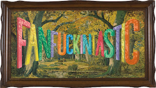
1. Wayne White
-American
-Works in America
-Predominately in oil paint
-Landscapes juxtaposed with a humorous or topical comment
-People going to galleries
-Elephant Journal. Spring 2012 pg 15

2. Kerry Lemon
-English
-England, Surrey/London
-Digital
-Advertising themes include; food, nature, animals
-Shoppers passing products
-Amelia's Anthology of Illustration
(Amelia Gregory, Hardback 1st Edition of 3000, Amelia's House, December 2009, pgs 138-143)
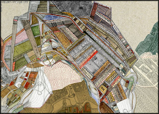
3. Nigel Peake
-English
-England
-Watercolour and ink/pen
-Buildings, maps, bikes, nature
-People who go to galleries and look at art books
-Bicycle Travel Journal
(Nigel Peake, Magma for Laurence King, 2011)

Subscribe to:
Comments (Atom)

